

13 Mar 2026 Color Trends d2e is Actually Excited For (Sorry, Cloud Dancer)
If you’ve been keeping an eye on the design world lately, you’ve likely seen the collective “sigh” over Pantone’s 2026 color of the year – Cloud Dancer. For those of us ready to move past the era of whites and grays, this neutral felt more like playing it safe rather than a bold leap into the new year. At d2e, we love a good splash of color! Read on to learn about the color trends our team sees bringing character and depth into spaces this year!

Amy Cuker
Interior Designer
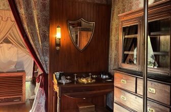
Crimson is a deep and stately hue that I’m loving at this moment because while it’s been associated with luxury for centuries, designers are using it in unexpected ways right now. You might typically think of crimson velvet or leather as appropriate for a chair in a library space. But I’m seeing it on full walls of cabinets or a full wall of bathroom tile—this maximalist gesture is simultaneously rich and surprising. I also got a crimson winter coat this year, and I can’t help but notice that when I walk into a room, it’s probably the most common winter coat color this year, after black (and after the frigid winter we’ve had, who needs more black?). Some beautiful crimsons include Farrow & Ball’s Preference Red (as shown on the cabinets below) or Behr Rumors (MQ1-15).


Jillian Moskovitz
Design Consultant
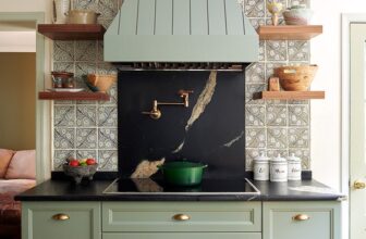
Though I’m typically a fan of white, with all the snow we’ve had in the northeast, I have been craving color and greenery. Rich tones are for sure gaining popularity and I like to see them paired with unexpected colors. I’m particularly liking bold, full-bodied greens next to light to mid-tone blues. Greens and blues are both individually quite popular in all rooms of home design but not often used side by side. I think that will change this year.


Stephanie Ebner
Design Consultant
I am loving rich, dark browns with velvety red undertones that bring a sense of drama to traditional earth tones. I love how effortlessly it feels at home in a variety of styles, adding warmth to sleek, modern spaces and a touch of old-world charm in more traditional design. This trend extends beyond just paint, finding its way into richly stained wood cabinetry, lush velvets, and even in textured tiles.I think this shift toward rich browns and dark woods is a return to interiors that feel grounded and full of character.


Avigail Cohen Sorek
Design Consultant
While I love the bold direction so many of us are seeing this year, what’s really catching my eye is the quieter shift happening behind it-the move toward warm, earthy neutrals. Soft clay, muted terracotta, and dusty ochre tones are showing up everywhere right now, but in a more refined way than we’ve seen before. These aren’t the saturated desert tones of past trends-they feel chalkier, calmer, and almost sun-washed over time.What I love about these hues is how effortlessly they bridge the gap between neutral and color. They add warmth and depth without overwhelming a space and work beautifully with natural materials like white oak, limestone, and plaster. In a moment where many of us are craving interiors that feel grounding and comfortable, these tones help create spaces that feel layered, human, and quietly inviting-the perfect complement to the bolder palettes emerging this year.


Tara Kingsley
Operations Manager
Deep, earthy reds are making a statement in the design space, and that’s definitely been on my mind. I’ve been working on a powder room glow-up in my own home, to add personality to our new build. I took inspiration from the actress Michelle Dockery’s home, as featured in Architectural Digest, and applied the “unexpected red theory” to the room. This is the concept that a pop of red elevates a space by creating a focal point. To that end, I chose Crabby Apple (SW 7592) from Sherwin Williams for both the trim and the door. I’ve never used a paint color so bold, and I must say, it’s very satisfying. As you can see in the picture of a home’s front door below, the brownish undertone keeps the red in check and lends a certain sophistication. I just might graduate from an accent of red to an entire room!


Is there a color that you’re enthusiastic about and envision in your home? We do paint consultations as well as design work, so let us know what’s on your mind. You can reach out to us via our Client Contact Form and we will get back to you!