
The impulse to make art is integral to the human experience, yet even the most seasoned artists can find themselves unsure how to begin when faced with a blank page. Our Art Prompts are designed to hone the hand, sharpen the eye, and offer refreshing pathways into the creative process. If you’d love to build consistency in your artmaking, overcome a period of creative stagnation, return to your practice after a break, or work outside of your comfort zone, the Jackson’s Art Prompts provide the structure and insight to help, combining practical advice with art historical context. As you work through each prompt, we encourage you to share what you create and connect with fellow artists exploring the series alongside you.
Light, Tone, and Value is the second in the series of prompts. These prompts are designed to help you adjust the mood of your work, practise new mark-making techniques to create tone, sharpen your observation of light and shadow, and more.

Drawing with tone is simple – but intentionally drawing with a full range of tone can be trickier than it sounds. By comparing a drawing to a reference tonal gradient, artists are better equipped to notice subtle shifts of tone in their subject and to add any missing ones to their work. In quick tonal studies, artists often simplify tone into broad sections of ‘light’, ‘mid’, and ‘dark’. This strategy is incredibly helpful for starting a study – but lacks the nuance that a full range of tone creates in a more developed work. This is essential for making illusionistic drawings that feel immersive and convincing.
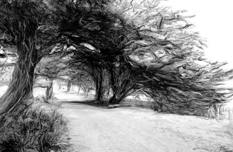
For this prompt, make a drawing of a landscape en plein air, inspired by Appian’s work below. To begin, draw a long rectangular box on a separate sheet of paper. Fill it with a gradual gradient using your pencil or charcoal, from the darkest possible tone to the lightest, and leave a section of blank paper at the end. Divide this bar into 10 equal parts, and make sure that your drawing includes a portion from each tonal section, even if it’s very small. This technique can reveal biases in your drawing by exposing whether you naturally tend towards making light, mid, or dark tones dominant.
You will need: A graphite pencil, black coloured pencil or charcoal, and a sketchbook or a sheet of paper
Fact: Charcoal was used during the Renaissance for preparatory drawings and for scaling up compositions for paintings. It wasn’t until the 19th century that it became respected as a fine art medium in its own right, when it was accepted by the École des Beaux-Arts in 1863 as a valid drawing medium. Artists began using charcoal to produce complex tonal drawings, coinciding with the invention and popularisation of spray fixatives that could secure these works. Masters of the medium were referred to as fusainistes, after fusain – the French word for charcoal.

Adolphe Appian
Charcoal with stumping and scratching out, 54.9 x 97.2 cm | 21.6 x 38.3 in
The Metropolitan Museum of Art

It would be challenging to find an artist who hasn’t admired Caravaggio’s masterful handling of chiaroscuro. But what’s a simple strategy to experiment with painting like him? By beginning with a chiaroscuro underpainting, artists can establish dramatic lighting conditions before building up complex modelling and detail. Before you start, position a sitter or object in front of you in a darkened room, then turn on a single lamp. Direct this light towards your subject to enhance the emotive effect of their appearance, and experiment with the angle.
Start painting by loosely marking the position of your subject on your canvas or panel with lean Burnt Sienna. Next, use the same colour to block in areas of tone broadly, leaving the white of the surface blank where the light is strongest. Then reinforce the darkest shadows with a rich chromatic black mixture made from Alizarin Crimson and Prussian Blue. Use Titanium White mixed with Burnt Sienna to refine the midtones. To continue the painting, wait for the underpainting layer to dry, then build on top of the tonal framework with detail, colour, and texture.
You will need: Burnt Sienna, Alizarin Crimson, Prussian Blue and Titanium White oil or acrylic paint, a canvas or panel, brushes, a palette, and a jar of medium or water.
Fact: When a skeleton believed to be Caravaggio’s was exhumed in 2010, the bones were tested and found to contain unusually high levels of lead and mercury. It’s thought that this exposure could have derived from the toxic paints he used, including Lead White, and may have ultimately contributed to his death. The effects of lead poisoning can be conducive to erratic and violent behaviour – which also aligns with Caravaggio’s turbulent outbursts of aggression.

Michelangelo Merisi Caravaggio
Oil on canvas, 94 x 125.4 cm | 37 x 49.4 in
The Metropolitan Museum of Art

Tonalism refers to artworks with a restricted palette within a narrow range of mid and dark tones, with no bright lights. The muted quality of the palette lends itself to nocturnal scenes. It encourages emotive contemplation on themes such as mortality, memory, and time – reflecting our primal reaction to fading light. It also poses a formal challenge by removing the device of highlights used to suggest form or create contrast.
Work from the setting sun, either inside or outside, as darkness falls. You may need to return to the same painting over a number of sittings to capture the fading light. Begin by applying a strong coloured ground to a canvas or panel. This will immediately establish your mid tone, meaning no part of the painting should become lighter than this colour. Then build up the rest of the work in deeper colours, which diffuse into shadow with chromatic browns, greys, and blacks.
You will need: An assortment of oil or acrylic paints, a canvas or panel, a palette, a jar of medium or water, and brushes
Fact: Tonalism derives from the late 19th-century American art movement of the same name. The Tonalists used a restricted palette to provoke emotion in the viewers of their paintings, by rejecting both pure representation and narrative as essential factors for artmaking. This aligned with how they felt classical music was composed: striking emotional chords in audiences, without prescribing the story they should imagine whilst listening to it. James Abbott McNeill Whistler titled many of his works after musical terms, like Nocturne and Symphony, because of this correlation.

James Abbott McNeill Whistler
Oil on canvas, 31.1 x 51.8 cm | 12.2 x 20.4 in
Philadelphia Museum of Art

Making a drawing on black creates the challenging inverse experience of working on a conventional white surface. Regardless of the colour you use, you now have to draw by adding light rather than darkness. Techniques like hatching and blending that would usually allow you to build darker tones now do the opposite. To make your drawing on black, use a sheet of black paper or prepare a sheet with a couple of layers of black gesso, then draw on it with a white or light coloured pencil.
For this prompt, work from the people around you, whether you’re drawing people walking down the street or sitting across from you. When drawing on black paper, it can be tempting to add too much light too quickly, which can weaken the illusion of form emerging from darkness. For your drawing, work slowly using the fewest possible lines and marks, to allow the mind to fill in areas of shadow.
You will need: Black paper or black gesso, and a white or light coloured pencil
Fact: Chrysography is the name for the art of writing in gold. Buddhist scrolls made on black paper with gold ink symbolise clarity and spiritual wisdom, since the gold does not tarnish and resists the darkness around it.

Unidentified artist, China
Gold on black paper, 26.7 x 384.2 cm | 10.5 x 151.3 in
The Metropolitan Museum of Art

Frottage comes from the French word ‘frotter’, which means to rub. Frottage is a drawing technique created by laying paper over textured surfaces and rubbing over the sheet with drawing materials. This action picks up the patterns, shapes, or designs onto the surface, relying on a level of chance to create surprising marks and effects. The sheet can be rotated or moved around, allowing the artist to add sections of different rubbings to the same sheet to build up a network of marks.
To make your own frottage drawing, collect a variety of objects that will provide texture under your paper, or walk around with a sheet to pick up textures from your environment. Use pencil for a more precise impression, and charcoal for broader shapes. Thin paper will allow you to pick up more details from your rubbings, but it can tear when pressure is applied over uneven surfaces. Thicker paper won’t show as much detail, but you will be able to build dark shades.
Once you’ve built up your frottage, you could add to it by drawing on top – using the collected marks as a point of departure for the imagination. Otherwise, leave it as a pure frottage drawing.
You will need: Charcoal or a pencil, a sheet of paper, and assorted textured objects
Fact: Although frottage was coined as a Fine Art technique by the Surrealist Max Ernst, the tradition of making rubbings has existed since the 2nd Century AD in East Asia. They were made as a means of preserving, documenting, and distributing religious texts inscribed in relief, as well as carvings, in a portable form. These rubbings were regarded as artworks in their own right. And to this day, they preserve evidence of the historic craftsmanship of artefacts that are lost to time.

Cambodia
Ink on paper, 112.1 x 110.5 cm | 44.1 x 43.5 in
The Metropolitan Museum of Art

Paintings with a high-key palette are made entirely in light and mid tones, with no dark tones. This gives them an airy, ethereal quality, as though we’ve caught the sunlight in our eyes or the image is emerging from a memory. In contrast with the emotive weight of chiaroscuro and the grounding realism of a full range of tone, artworks with a high-key palette can create an uplifting or sentimental feeling, demonstrating how value influences the emotive reception of artworks. To make a painting with a high-key palette, choose a restricted selection of a few bright colours and white – but no black. Each colour can be tinted with white as needed, to keep the palette in the mid and light tones.
You will need: An assortment of oil or acrylic paint, a canvas or panel, a palette, a jar of medium or water, and brushes
Fact: Berthe Morisot’s daughter, Julie, became a key muse in her oeuvre and was painted more than 50 times by her mother by the time she turned 12. These works tenderly chart her growth and, in many instances, use a high-key palette that reflects the Impressionists’ focus on light – alongside Morisot’s characteristically dynamic brushwork.

Berthe Morisot
Oil on canvas, 65.6 x 52.1 cm | 25.8 x 20.5 in
National Gallery of Art

It’s almost a given that the first marks made in a drawing are lines. This is often a default strategy for understanding form, as we immediately search for anchoring edges that lines create. Taking away this element and working with pure tone demands a different kind of observation. Instead of finding outside edges, you are forced to work within the forms in front of you. This encourages a greater understanding of subtle tonal variations through a slower drawing process. Purely tonal drawings often have a meditative or silent quality, as opposed to the visual noise of rapid linework. For this prompt, use a conté crayon or piece of charcoal to draw a portrait without using any lines. Choose a paper with tooth to ensure you can build up rich, dark areas with your drawing media.
You will need: A Conté crayon or charcoal, and a sheet of paper with tooth
Fact: The Pointillist Georges Seurat didn’t just work with shimmering constellations of colour – he also created a series of velveteen tonal Conté drawings that are intentionally devoid of lines. His close friend Paul Signac called them ‘the most beautiful painter’s drawings that ever existed.’ Seurat himself wrote, ‘I always begin with the shadows…as that’s what strikes you the most, it’s therefore what one ought to render first.’

Georges Seurat
Conté crayon on paper, 31.2 x 24.1 cm | 12.3 x 9.5 in
The Metropolitan Museum of Art
Further Reading
Jackson’s Art Prompts Course: The Fundamentals of Drawing
Chiaroscuro Techniques for Painting, Drawing, and Printmaking
Erasing Techniques for Dry Media
Recreating the Colour Palette of Berthe Morisot
Shop Art Materials on jacksonsart.com
The post Jackson’s Art Prompts Course: Light, Tone, and Value appeared first on Jackson's Art Blog.