

Whole Life Insurance · How to Buy It
Short Answer
How do you read a whole life insurance illustration? Skip the regulatory pages and find five things: which columns are guaranteed, how the premium is split, cash value against premiums paid in years 1 and 10, the 7-pay (MEC) limit, and the loan terms behind any income page. For a policy built to grow cash, paid-up additions should be at least half the premium and year-one cash value should be more than half of year one’s premium.
Someone hands you a whole life illustration. It runs page after page, the legal department clearly got hold of it before you did, and the person who gave it to you raises their eyebrows like it’s great news. You flip through columns of numbers and have no idea what any of it means.
That’s an understandable place to be. Illustrations are dense on purpose: a good share of every one exists because a regulation says it has to, like the page that tells you the insurance company’s name and mailing address. Very little of it answers the question you actually have, which is whether this policy was built to do what you want.
So a lot of people now paste the whole thing into ChatGPT, get back a pile of answers they can’t check, and ask whether anyone can help them make sense of it. More and more often, it sends them to us. Here’s what we tell them: find five things, in order. It takes about five minutes once you know where to look.
Staying in Our Lane
We work only with cash value life insurance and fixed annuities. Nothing here is investment advice. Securities have their place in a retirement plan, and questions about them belong with your investment advisor. Every figure below is labeled guaranteed or current. Current figures use one carrier’s 2026 dividend scale, which is not guaranteed and will change.
Quick Reference
The Five Checks, in Five Lines
- Guaranteed vs. current. Find both columns before you read a single number, and notice which one any summary points at.
- The premium split. In a policy built for cash, paid-up additions are by far the biggest piece: at least half the premium, usually more.
- Years 1 and 10. On $50,000 a year, look for more than $25,000 of cash value after year one and more than $500,000 after year ten (current scale).
- The 7-pay limit. On a $50,000 premium, a limit around $60,000 to $65,000 is a very good sign. Double the premium means too much death benefit for a cash design.
- Loans and income. Multiply the cash value in the year income starts by 5%. If the illustrated income is closer to 6.5%, something aggressive is holding it up.
Before You Start: What This Is (and Isn’t) For
Two ground rules. First, these checks are written for someone buying whole life to build cash value: money to borrow against, to draw on in retirement, or to use in a business. If what you need is the largest death benefit your premium can buy, for an estate bill or a business agreement, the rules change, and a policy that fails several of these checks may be exactly the right one. We walk through both designs side by side in how to buy whole life insurance without ending up with a bad policy.
Second, this is elementary on purpose. Nobody becomes an illustration expert in five minutes, and we’re not pretending otherwise. The goal is narrower and more useful: to know whether what you’re holding is in the right neighborhood, and which questions to ask if it isn’t. One quick step before the five checks: make sure it’s actually you on page one. The age, sex and health class on the cover drive every number that follows.
To keep the numbers concrete, we use the same example throughout: a 45-year-old man, preferred non-tobacco, putting $50,000 a year into a policy for twenty years, illustrated by one major mutual insurance company on its 2026 dividend scale. Brandon ran these designs in September 2026, and they’re the same figures in our free buyer’s guide.
Check 1: Which Columns Are Guaranteed, and Which Are Current
Every whole life illustration shows at least two sets of values, usually laid out as big ledger pages of columns (that’s why they’re called ledgers). One set is guaranteed: written into the contract, and it will happen even if the policy never pays another dividend. The other is non-guaranteed, which on a whole life policy means it’s driven by the dividend. Some illustrations add a midpoint column between the two. Our post on the basic and supplemental ledgers shows what each one looks like.
Find both before you read any number, then notice which one the summary or cover letter was pointing at. Leading with the current column is normal, since it reflects what the company is paying today, but you should know where the floor is too. In our example, the well-built $50,000 policy’s cash value passes total premiums paid in year 6 on the current scale and in year 11 on guarantees alone. Both are sensible. A design whose guaranteed column stays below what you’ve paid in for two decades is telling you what it was built for.
Here’s the one thing we can promise about the non-guaranteed column: it will not turn out exactly as printed. It will be higher or lower, and nobody knows which. That’s simply what non-guaranteed means.
Why illustrations got a reputation for overpromising
For years, a common criticism was that whole life illustrations wildly overstate what’s possible. It came from a real place. Policies sold when dividend scales were near their peak, in the high-interest-rate years of the 1980s, were illustrated as if those dividends would last forever. They didn’t. Dividends followed interest rates down from the early 1990s on, and the actual values came in well under the original projections. The Journal of Financial Planning has a good history of how that played out.
But dividends didn’t fall in a vacuum. Everything tied to interest rates fell with them. A five-year Treasury averaged about 6.4% in 1995 and about 1.5% in 2015, according to Federal Reserve data, and anyone who expected 1995’s CD rates to hold for twenty years was disappointed the same way. The companies weren’t arbitrarily deciding to keep more of the money. They were illustrating what they were paying at the time. Today’s rules also cap how optimistic an illustration can be: under the NAIC’s Life Insurance Illustrations Model Regulation, a company can’t illustrate a dividend scale more favorable than the one it’s currently paying, and an illustration actuary has to certify each year that the scale is supported by the company’s actual recent experience.
Check 2: Where Your Premium Is Going
This is one of the most important checks, and one of the harder ones to judge. Somewhere in the illustration, usually in the first couple of pages or in a premium summary, there’s a breakdown of where your premium actually goes. To someone new to whole life, that sounds strange: isn’t it all just going to life insurance? Not when the goal is cash value.
In a policy built for cash, the premium is split into at least three parts:
- Base premium, which pays for the underlying whole life policy and its guaranteed death benefit.
- A term rider, which keeps the death benefit high enough for the tax rules (more on that in Check 4) without tying up premium in permanent coverage.
- Paid-up additions, small blocks of fully paid-up insurance that turn into cash value much faster than base premium does. Our post on paid-up additions explains why.
For a cash-focused design, paid-up additions should be by far the largest of the three. At least half the premium should go there, and generally more. In Brandon’s $50,000 design, about 74% goes to paid-up additions ($37,003), 14% to base ($7,019) and 12% to the term rider ($5,978). If the split shows all or nearly all base premium, you know the policy was built for death benefit, and that’s the first question to ask about it.
We’ll be honest about one limit of this check: there’s no magic ratio. Companies build their contracts differently, so a lower share of paid-up additions at one company can still produce a better policy than a higher share at another. That’s why we’re skeptical of rules like the 90/10 split as a universal answer. And if you’re told a special product with an impressive name, something like “high early cash value” or “executive whole life,” makes the split unnecessary, ask to see the numbers anyway. A name isn’t a design. We’ve written about where high early cash value policies actually fit.
While you’re on that page, find out whether the paid-up additions rider is flexible or level. A flexible rider lets you put in more or less in a given year, while a level one expects the same amount every year.
Check 3: Cash Value in Year 1 and Year 10, Against What You Paid
This one needs no insurance expertise at all. Put two numbers side by side, cash value and total premiums paid, at the end of year one and the end of year ten.
- Year one: if the cash value is more than half of what you paid, you’re headed in the right direction. On a $50,000 premium, that means more than $25,000.
- Year ten: if the cash value is more than you’ve paid in, that’s another good sign. On $50,000 a year, you’d like to see more than $500,000.
Here’s how our two $50,000 designs compare on exactly those two checks.
TIPB Analysis
Cash value as a share of premiums paid
Same 45-year-old, same company, same $50,000 a year. Current dividend scale.
Built for cash (74% paid-up additions)
Built for death benefit (all base premium)
Hypothetical example for illustrative purposes only. Male, age 45, preferred non-tobacco, one major mutual carrier, 2026 dividend scale, premiums paid for 20 years to age 65. Current values are not guaranteed.
The all-base design isn’t a broken policy. It bought about $3.56 million of death benefit, more than three times as much as the cash design. But if you wanted cash, it shows nothing in year one and is still behind what you’ve paid after ten years and half a million dollars.
One detail worth knowing: the year-ten test is a current-scale test. On guarantees alone, even the well-built design is about $2,000 short at year ten ($497,925 against $500,000 paid) and passes in year eleven. So if you’re reading only the guaranteed column, don’t fail a good policy by a rounding error. And there’s no shortcut around the math: the fastest way to have half a million dollars of cash value in a policy is to pay in a little more than half a million dollars.

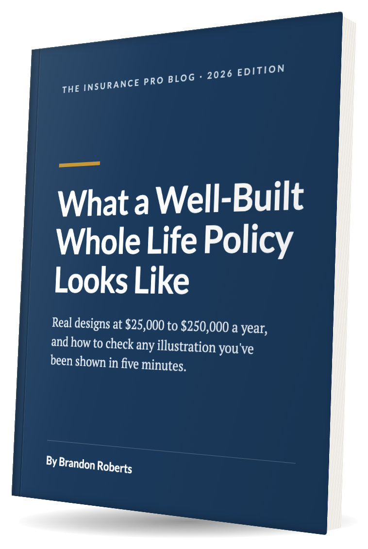
Want the numbers at your budget? Our free guide, What a Well-Built Whole Life Policy Looks Like, shows year-by-year values for well-built designs at $25,000, $50,000, $100,000 and $250,000 a year, so you have something to hold your illustration up against.
Check 4: The 7-Pay Premium (the MEC Limit)
Usually in the tax pages, you’ll find the modified endowment contract premium, most often called the 7-pay premium. Under section 7702A of the tax code, a policy funded faster than that limit becomes a MEC. It’s still life insurance, but loans and withdrawals lose their favorable tax treatment under section 72(e). Our guide to modified endowment contracts covers the rules.
What you’re checking is how close the 7-pay premium sits to the premium you plan to pay. The limit is driven by the death benefit, so it tells you how much death benefit your premium is carrying.
| 7-pay limit on a $50,000 premium | What it usually means for a cash design |
|---|---|
| About $50,000 | It works, but there’s little room. Expect real limits on how much more, or how much longer, you can put money in. |
| About $60,000 to $65,000 | A very good sign. The death benefit is close to the minimum the premium needs, with a cushion. Brandon’s design: $63,663. |
| $100,000 or more | The policy carries far more death benefit than a cash design needs, so less of each dollar becomes cash value. That’s fine if you need the death benefit, and the wrong design if you asked for cash. |
Where exactly it should land depends on how long you plan to pay. A shorter premium-paying period pulls the limit closer to your premium, and a longer one pushes it further away. But even for a policy you intend to fund for decades, around $65,000 on a $50,000 premium is about the most we’d want to see. If you asked for the policy with the best cash value over ten years and the 7-pay limit is double your premium, the design doesn’t match the goal you stated.
Check 5: The Loans, and the Income Page
This is the hardest check to do from the illustration alone, because most illustrations barely explain how their loans work. You’ll see columns for loan balances if loans are being illustrated, but the provisions themselves usually live elsewhere. Still, two things are worth pulling out.
The 5% sanity check on illustrated income
If the illustration shows you paying premiums to 65 and then taking income through policy loans, compare the income to the cash value. Take the cash value in the year income starts and multiply it by 5%. That’s a reasonable estimate of what the policy can support for life. In Brandon’s $50,000 design, the illustrated income of $80,690 a year from 65 to 90 is 5.0% of the $1,613,790 of cash value at 65 (current scale).
- Closer to 6.5% or more: some aggressive assumptions are probably holding the number up. Find out what they are.
- Well under 5%: not a red flag on its own. Often whoever ran it simply chose a round number. Just ask why.
Illustrated income holds the dividend scale and the loan rate constant for decades, and it assumes things nobody can know, like exactly when you’ll stop taking income. That’s why we rarely build our advice around income illustrations at all. We use the 5% rule and treat the illustration’s income page as a shape, not a promise.
The loan provisions
Find out the loan rate, whether it’s fixed or variable, and whether the company uses direct or non-direct recognition. We’ve long said recognition matters less than people think, but you should know how loans affect your dividend, especially when the income page assumes years of loans. Brandon’s runs use a variable rate set from Moody’s corporate bond index (5.4% when they were run) and direct recognition.
If you plan to use the policy as a source of capital, the loan provisions are close to everything. One business owner we work with finances his inventory through policy loans every year instead of borrowing from a bank. For him, the details matter: how interest is calculated, whether it accrues daily, whether it’s charged in advance or in arrears, and what happens when he pays a loan back in the middle of a policy year. None of these makes a policy better or worse on its own. You just don’t want to be surprised. How policy loans work covers the mechanics.
The Five Checks on One Page
Here’s the whole thing as a scorecard you can hold next to any illustration you’ve been shown. The shaded column is Brandon’s well-built $50,000 design.
| Check | Where to look | A good sign (cash design) | Our $50K example | Ask about it if |
|---|---|---|---|---|
| 1. Columns | Ledger headings | Guaranteed and current both shown | Passes premiums: year 6 current, year 11 guaranteed | A summary quotes only one column |
| 2. Premium split | Premium summary, first pages | Paid-up additions at least half | 74% paid-up additions | It’s all or mostly base premium |
| 3. Years 1 and 10 | Ledger | Year 1 over half of premium, year 10 over premiums paid (current) | $39,503 and $588,025 | Year 1 is near zero |
| 4. 7-pay limit | Tax or MEC page | Somewhat above your premium | $63,663 on $50,000 | It’s near double your premium |
| 5. Loans and income | Loan columns, policy summary | Income near 5% of cash value at the start | $80,690 on $1,613,790 (5.0%) | Income is near 6.5% or more |
Hypothetical example for illustrative purposes only. Rules of thumb for a policy bought to build cash value. Every company designs and illustrates differently. Current values use one carrier’s 2026 dividend scale and are not guaranteed.
Practitioner Take
If You Can’t Find the Five Things, That’s Your Answer
If you can find these five things in five minutes, you’ve done more than most people ever do before they sign. If you can’t find them, or the person who gave you the illustration can’t show you where they are, that tells you something too.
None of this is hidden. The premium split, the 7-pay limit, the guaranteed column: they’re all printed in the illustration. They’re just rarely pointed at.
Three Traps While You’re Reading
The illustration beauty contest
It’s tempting to line up illustrations from different agents or companies, look at the projected cash values, and declare the biggest number the winner. We understand the logic. But a lot goes into those figures that may or may not hold up, and it isn’t something you can see on the page.
After the financial crisis, interest rates were cut sharply and many companies cut their dividend scales. One company was in a position to leave its scale almost unchanged for a while, and for a stretch its illustrations looked considerably better than nearly everyone else’s. It became the illustration hero, and it likely won a lot of sales because its ledgers showed the most cash. The illustrations didn’t hold up. We’ve also seen a company whose loan-funded income looked wildly better than the competition’s because of an unusually wide gap, about two percentage points, between its dividend rate and its loan rate. When we illustrated income for that company, we narrowed the gap ourselves, because we didn’t believe it would last twenty years.
Companies do differ, and some differences are real. But when one illustration is far ahead of the pack, the question is how long the company will keep doing whatever makes it look that way. Compare the designs first (the split, the death benefit, the pay period), and only then the numbers. We’ve written more about the illustration beauty contest and whether you should use illustrations to compare policies at all.
“Just lower the dividend” isn’t the fix
Common advice online is to ask for the same illustration at a lower dividend scale. You can: a company can’t illustrate above its current scale, but it can go below it, and you can change the loan rate too. The problem is what the reduced version actually means. Cutting the scale a full point changes it forever and holds it flat for the life of the policy. That’s no more realistic than the illustration you started with. It swaps one fixed assumption for another.
Where a reduced run does help is comparing designs under the same assumption. In our example, with the dividend scale cut a full point for life, the well-built $50,000 design’s illustrated income drops from $80,690 to $71,882 a year, and it still beats the all-base design’s $65,303 with no cut at all. We cover the method in reducing dividends when running illustrations.
Treating the income page as a forecast
An illustration that says you’ll put in $50,000 a year, have a large pile of cash at 65, and draw a big income from it for decades is showing you one path among many. It holds the dividend scale and the loan rate constant and assumes when your income stops. Approach it with caution, use the 5% check, and ask what’s being assumed.
A Word About AI
What ChatGPT gets wrong about your illustration
AI is a genuinely useful tool, and it does surprisingly well with a life insurance illustration if you first explain how one should be read. But ask it cold whether your policy is any good and these are the mistakes we see most:
- It judges the product and skips the design. You get the rip-off-or-miracle debate about whole life in general, not an answer about how this policy was built.
- It mixes up the columns. Current values get quoted as if they were guaranteed, or one illustration’s guaranteed column gets compared with another’s current column.
- It rate-shops. It goes looking for declared dividend rates, which aren’t your return and can’t be compared across companies. Our 2026 dividend analysis explains why.
- It can’t see what isn’t printed. Whether the paid-up additions rider is flexible, how the term rider behaves, what the loan provisions do in practice.
- It never has to live with the answer. It won’t be there in year four when the statement looks disappointing.
The bigger problem is that a lot of what’s on the internet about whole life is incomplete, and that’s what AI learns from. You get true statements mixed with untrue ones, and if you don’t already know the subject, you can’t tell which is which. It’s a good place to start and a bad place to finish. If you’ve already asked it, paste what it said into our Run My Numbers form, and we’ll tell you what it got right and what it got wrong.
Frequently Asked Questions
How do you read a whole life insurance illustration?
Start by finding five things instead of reading every page. First, which columns are guaranteed and which are based on the current dividend scale. Second, how the premium is split among base premium, paid-up additions and any term rider. Third, the cash value at the end of year 1 and year 10 compared with total premiums paid. Fourth, the 7-pay (MEC) limit compared with the premium you plan to pay. Fifth, the loan terms and any illustrated income. Together these tell you what the policy was built to do.
What is the difference between guaranteed and non-guaranteed values on a whole life illustration?
Guaranteed values are written into the contract and will happen even if the policy never pays another dividend. Non-guaranteed values, usually labeled current, assume the company’s current dividend scale continues unchanged for the life of the policy. They will turn out higher or lower than illustrated. Under the NAIC illustration model regulation, a company cannot illustrate a dividend scale more favorable than the one it is currently paying.
How much of a whole life premium should go to paid-up additions?
For a policy built to grow cash value, paid-up additions should be the largest part of the premium, at least half and generally more. In one 2026 example of a well-built $50,000-a-year design for a 45-year-old, about 74% went to paid-up additions, 14% to base premium and 12% to a term rider. There is no single correct ratio, because companies design their contracts differently.
How much cash value should a whole life policy have after the first year?
For a policy designed to build cash, cash value at the end of year one should be more than half of the first year’s premium. On a $50,000 premium, that means more than $25,000. A well-built $50,000 design in our 2026 example showed $39,503 on the current dividend scale, about 79%. A policy built entirely from base premium can show little or nothing in year one.
What does the 7-pay premium on a whole life illustration tell you?
The 7-pay premium is the most you can put into the policy each year without it becoming a modified endowment contract. Because it is driven by the death benefit, it shows how much death benefit your premium is carrying. For a cash-focused design with a $50,000 premium, a 7-pay limit around $60,000 to $65,000 is a very good sign. A limit near double the premium means the policy carries more death benefit than a cash design needs.
How much retirement income can a whole life policy realistically support?
A reasonable rule of thumb is about 5% of the cash value in the year income starts, taken through policy loans. If an illustration shows income closer to 6.5% of the cash value or more, it is probably relying on aggressive assumptions such as a dividend scale and loan rate held constant for decades. Illustrated income is not guaranteed and depends on future dividends and loan rates.
Should you compare whole life illustrations from different companies?
Comparing projected cash values across companies and picking the biggest number is risky, because the figures rest on different dividend scales, designs and assumptions, and the one that looks best today may not hold up. Compare the designs first: the premium split, the death benefit and the pay period. Then compare the numbers.
Can ChatGPT tell me if my whole life illustration is good?
It can be a useful starting point, especially if you first explain how an illustration should be read. Asked cold, it tends to judge whole life in general instead of the policy’s design, mix up guaranteed and current values, compare declared dividend rates that are not your return, and miss provisions that are not printed in the illustration. Have someone who designs these policies check its conclusions.
Already holding an illustration?
Send it to us, and see what yours should look like
Everything above was one 45-year-old putting in $50,000 a year. Your situation isn’t general. Tell us a few things about where you stand and upload the illustration you’ve been shown, or paste in what ChatGPT told you about it. Brandon will build a design at your numbers and send you a private video walking through it page by page, within two business days. If whole life isn’t the right tool for you, the video will say so.
- Upload your illustration
- Private video walkthrough
- No call, no pitch
Not ready for your own numbers yet? The free buyer’s guide walks through these same five checks, with well-built designs at $25,000 to $250,000 a year to compare against.
Hypothetical example for illustrative purposes only. Individual results vary based on specific products, timing, and personal circumstances. Illustrated values come from one insured profile and one carrier; guaranteed values are contractual, and current values are based on the carrier’s 2026 dividend scale, which is not guaranteed and will change. The checks in this post are general rules of thumb for policies purchased to build cash value, not a complete review of any policy. Product suitability depends on individual circumstances including age, health, income needs, time horizon, and existing assets. This is general education, not a recommendation for any specific product, and not tax or legal advice. Policy loans accrue interest and reduce the cash value and death benefit; a policy that lapses or is surrendered with a loan outstanding can create taxable income. Guarantees are subject to the claims-paying ability of the issuing insurance company. We specialize in cash value life insurance and fixed annuities, and do not advise on securities.