

Jim Meyer won the Relief Runner Up Award in Jackson’s Art Prize this year with his work Foggy Morning, Lake Superior. In this interview, he discusses his inter-state search for inspiration, how high-contrast photography has influenced his work, and what made it special to portray fog on Lake Superior.
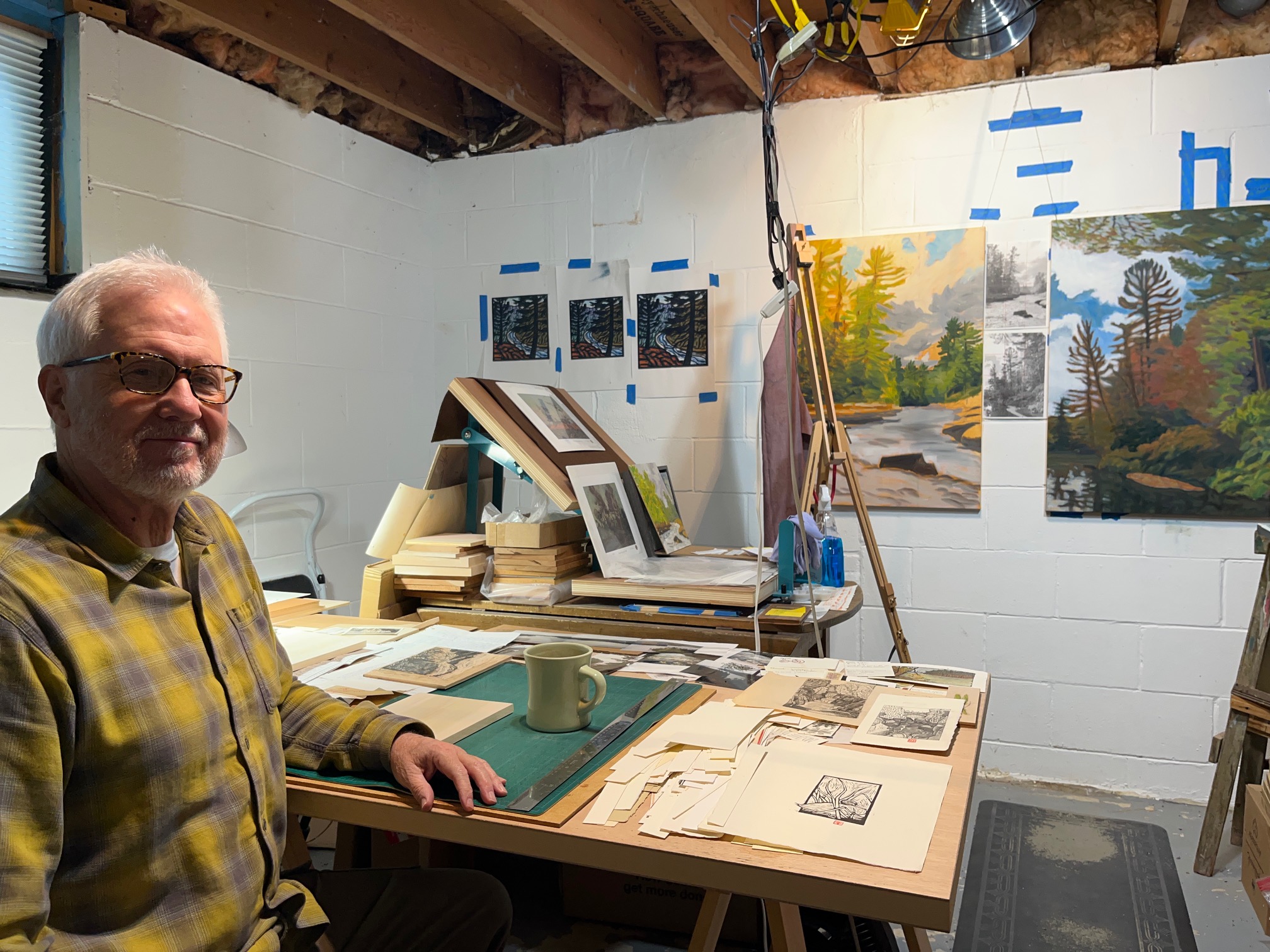
Above image: Jim in his studio

Jim Meyer
Woodblock print on paper, 17.8 x 17.8 cm | 7 x 7 in
Josephine: Could you share the story of how you became an artist and tell us more about your artistic background?
Jim: Along with doodling and drawing, I became interested in photography as a kid and was given a simple darkroom kit when I was 11 or 12. I could only develop and print black and white photos, and I came to really like it, getting more and more interested in high contrast black and white photos. I majored in biology in college but did take a few art classes – painting, drawing, and metal sculpture – as a break from the science labs.
After college, I met an illustrator in Minneapolis called Tom Foty, who introduced me to the world of illustration, which I hardly knew existed or had ever considered. But I was interested, and he encouraged me to put together a portfolio and try to get an art rep. Which I did, and I was extremely fortunate to get a rep (this was just before everything went online). I started doing pen and ink illustrations and, after running across another illustrator working in lino – Jack Molloy – I soon began making mostly simple lino and woodcut illustrations, eventually trying colour also. I really like working with the materials involved in the woodcut process – the wood itself, chisels, printing paper, and ink.
A few years later, I got another lucky break when a gallery in the Seattle area invited me to show my work in their gallery. From there, I got representation in several other galleries and switched to mostly making woodcuts to sell in galleries rather than illustration.

Jim Meyer
Woodblock print on paper, 12.7 x 18.4 cm | 5 x 7.25 in
Josephine: What does a typical working day in the studio look like for you? Do you have any important routines or rituals?
Jim: Not a whole lot of typical days here. If I’m working on a new print, I’ll spend a day or two sketching and working out the composition, doing watercolour studies, and then usually at least several days cutting the block or blocks. Days more printing.
But often I’m out looking for new ideas and inspiration – sketching, sometimes painting, taking photos – which usually involves driving to northern or southern Minnesota, sometimes Wisconsin, or, for longer trips, to Colorado, Montana, Washington State, or California.

Jim Meyer
Woodblock print on paper, 12.7 x 18.4 cm | 5 x 7.25 in
Josephine: Which materials or tools could you not live without?
Jim: Good question! There are quite a few.
Printing paper: Many weights and shades of the Rives papers; Hosho, Shiramine, Somerset, Copperplate, Mingeishi, Nishinouchi, Torinoko Lightweight, and Mulberry.
Printing inks: Caligo Safe Wash and Cranfield Traditional; Daniel Smith – using up old tubes since Daniel Smith doesn’t make printing ink anymore.
Chisels: I have a weird assortment of old ones inherited from my dad and grandfather, plus Swiss-made, but mostly newer Josei Moku Hanga To chisels.
Watercolours: A wide assortment from just about every manufacturer, along with a whole lot of brushes; my favourites are probably the Da Vinci Maestro Kolinsky Sable Brushes.
Wood: Shina, poplar, cherry, basswood, maple, and birch.
Pencils: For sketching, my favourites are carbon pencils, Conté à Paris 2B or 3B; Wolff’s Carbon 4B by Royal Sovereign; or Kimberly 9XXB by General Pencil Co. They can all go from light grey to very black.

Josephine: Do you work from a reference? Tell us more about your process.
Jim: Most often I get ideas for new prints while hiking in nature. Something that strikes me as an intriguing composition, with remarkable colours, or a unique feel. I take quick photos with my iphone, and then take some time to do a pencil sketch and sometimes a watercolour sketch.
In my studio, I do more sketches based on the on-site reference photos and sketches, aiming to simplify the composition, nail down colour, and figure out colour separations for printing the woodblocks.

Josephine: Do you regularly draw or keep a sketchbook? If so, how does this inform your work?
Jim: Yes, sketching is one of my favourite things to do, and I always do multiple sketches for each print.
I’ve made a lot of my sketchbooks using Rives heavyweight or lightweight printing paper, cutting it into roughly 7 x 10 in (17.8 x 25.4 cm) size, with about 25-30 pages that I sew together using binder’s thread. I really like sketching with a carbon pencil on that soft 100% cotton paper – it’s great for going from very light marks to very black blacks. Really nice to sketch with. I sometimes add watercolour even though that printing paper isn’t sized well, or at all, so colours soak in and aren’t very vivid, but you can still get a good idea of colour, and they can be enhanced later with coloured pencils or more watercolour layers.

Josephine: Have you ever had a period of stagnation in creativity? If so, what helped you overcome it?
Jim: Yes, many periods of stagnation, doldrums, and lack of motivation. What helps me most is either going out sketching, or even just hiking in nature. And I almost always find something that interests me to sketch and/or make a print about.
Another way I sometimes get out of the doldrums is to stop analysing and overthinking about a possible composition or new print and instead just start cutting a block, not expecting anything, and see where it goes. Sometimes it goes nowhere, but I end up feeling more motivated to get to work, and occasionally, it turns out to be something that I can use.

Jim Meyer
Woodblock print on paper, 18.4 x 19 cm | 7.25 x 7.5 in
Josephine: Are there any specific artists or mentors who have inspired you?
Jim: Definitely.
Printmakers: Gustave Baumann, Walter J Phillips, Frances Gearhart, Shiko Munakata, Un’ichi Hiratsuka, Kawanishi Hide, and Hokusai.
Painters: Van Gogh, Vuillard, Cezanne, Monet, Vlaminck, Sargent, Homer, The Canadian Group of Seven, and N.C. Wyeth.

Jim Meyer
Woodblock print on paper, 16.5 x 19 cm | 6.5 x 7.5 in
Josephine: What were you thinking about or exploring at the time you made Foggy Morning, Lake Superior? What inspired it, and how did it come to be?
Jim: I had been on a weekend gathering with friends on the North Shore of Lake Superior more than 25 years ago, and during the weekend took a few black and white medium-format photos of the shoreline. Going through a box of old photos a few years ago, I came across the photos I’d taken on that trip, including one that I decided to use as a reference for the Foggy Morning, Lake Superior woodcut. I liked the composition and the simplicity of it overall.

Jim Meyer
Woodblock print on paper, 16.5 x 15.9 cm | 6.5 x 6.25 in
Josephine: What made you submit this piece to Jackson’s Art Prize?
Jim: After I finished printing Foggy Morning, I liked the way the prints turned out, with the limited palette of colours, the simple design, and the interesting texture. The background fog gave it a mysterious tone and brought out the colours of the foreground. I thought it might be relatable to almost anyone who’s been around a rocky shoreline.

Jim Meyer
Woodblock print on paper, 16.5 x 24.1 cm | 6.5 x 9.5 in
Josephine: Could you explain a bit about the specific process you took to achieve the different colours in Foggy Morning, Lake Superior?
Jim: Foggy Morning is a reduction woodcut printed from one block of wood where, after each colour is printed, the portion of the block representing that colour is cut away. That process continues until the last colour is printed, and only that portion of the block remains.
I hand-printed this woodcut using a baren rather than a press. I printed the lightest colour first, which was the background fog and water. After that, the next lightest colour – the Yellow Ochre-ish in the foreground rocks, then the red-ish in the main rock formation, and the green in the foliage. Black was the final printing.

Jim Meyer
Woodblock print on paper, 16.5 x 24.1 cm | 6.5 x 9.5 in
Josephine: You’ve mentioned the unlikeliness of the ‘Foggy Morning’ occurring upon a ‘giant inland freshwater ocean’ that is Lake Superior. Could you expand on what this juxtaposition means to you in creating this piece?
Jim: I think what I was getting at was that I could be at that location on the North Shore 100 times and not see foggy conditions as the print portrays. The weather is so unpredictable on Lake Superior and on the North Shore, which made it special to me to show those foggy conditions.

Josephine: Are there any new techniques or ideas you’re excited to explore using the materials from your prize?
Jim: Yes, I’m looking forward to using the Caligo Safe Wash Inks and exploring more of their colour ranges, thanks to the gift from Cranfield and Jackson’s. I’ve mostly printed with traditional oil-based inks, so I’m looking forward to working with the slight differences of the Safe Wash inks, and I appreciate their easier clean up, not requiring solvents.

Jim Meyer
Woodblock print on paper, 16.5 x 10.1 cm | 6.5 x 4 in
Josephine: How did it feel to move through the stages of the competition and win the Relief Runner Up Award?
Jim: It was very surprising at each stage of the competition, especially knowing that so many thousands of people worldwide had entered and how many really good artists there were in that pool. It was very suspenseful all along the way, and I’m grateful to have made it that far.

Jim Meyer
Woodblock print on paper, 25.4 x 15.9 cm | 10 x 6.25 in
Josephine: What’s coming up next for you?
Jim: I’m working on new prints for the fall and after that the holiday season. Also experimenting with some larger sizes and more fluid designs.
Follow Jim on Instagram
Visit Jim’s website

Further Reading
Meet Angela Lizon, Winner of Jackson’s Art Prize 2026
Jackson’s Art Prize 2026 First Prize Winner Announced
How We Collaborate With Artists
Expert Advice on Making Your Way as an Artist
Shop Printmaking on jacksonsart.com






I was skeptical about trying it out at first, not gonna lie, but after playing for a couple weeks I was actually suprised how smooth everything ran and how they handle withdrawals pretty quickly. Definitely worth checking out if your on the fence like I was.
bigbaazi login
Эта публикация исследует взаимосвязь зависимости и психологии. Мы обсудим, как психологические аспекты влияют на появление зависимостей и процесс выздоровления. Читатели смогут понять важность профессиональной поддержки и применения научных подходов в терапии.
Нажмите, чтобы узнать больше – клиника алкоголизма