Hype Is Not Trend: reading design beyond visibility

In design work, reading trends correctly is not a minor detail.
It affects the projects you pitch, the directions you propose, the products you develop, the collections you launch. Get it wrong and you end up chasing something that was already over before it started.
The problem is that today, visibility can be misleading.
The project everyone is talking about is not always the one that matters most. The image that appears everywhere is not always the strongest signal. And the installation that dominated the feed for a week is not necessarily the one that will influence future interiors, products or brands.
This is something I think about a lot, and it was one of the central reflections behind the MDW26 Seminar I hosted inside TRENDBARK Studio, after publishing the new MDW26 Trendbook.
Because Milan Design Week is not only a place where design is exhibited. It is also a place where design is framed, photographed, narrated, shared, amplified, and definetely overexposed.
Watch the short video:
Hype Is Not Trend | Reading Milan Design Week Beyond Visibility

–
And this distinction matters enormously: hype is not trend.
Hype burns fast. It is often designed for visibility: it photographs well, circulates quickly, becomes impossible to ignore, dominates feeds and headlines, and then disappears as soon as the next media moment arrives.
A real trend moves differently. It settles more slowly into the cultural landscape. It changes what clients notice, what they desire, what they eventually choose, often long after the first image has disappeared from the feed.
Confusing the two can lead to the wrong aesthetic direction in a project, the wrong product brief, the wrong collection narrative, the wrong read of where the market is actually going.
Reading design beyond visibility means asking different questions:
/ Why is this project visible? / Who is amplifying it? / Is it a media moment or a deeper signal? / Does it appear across different contexts, sectors or markets? / Can it move into real interiors, products, materials or brand directions? / Will it still matter in twelve months?
This is exactly the kind of filter that professional trend intelligence is supposed to provide, and what I tried to bring into the MDW26 Seminar as a second layer to the Trendbook.
The Trendbook gives the structured forecast: colors, materials, styles, spaces, key directions filtered from field research. The seminar goes behind it, bringing my group into the behind-the-scenes of Milan, the doubts, the market dynamics, the conversations, the media layer, and the difference between what got amplified and what actually matters for design work.
The full MDW26 Seminar Replay is now available inside → TRENDBARK Studio.
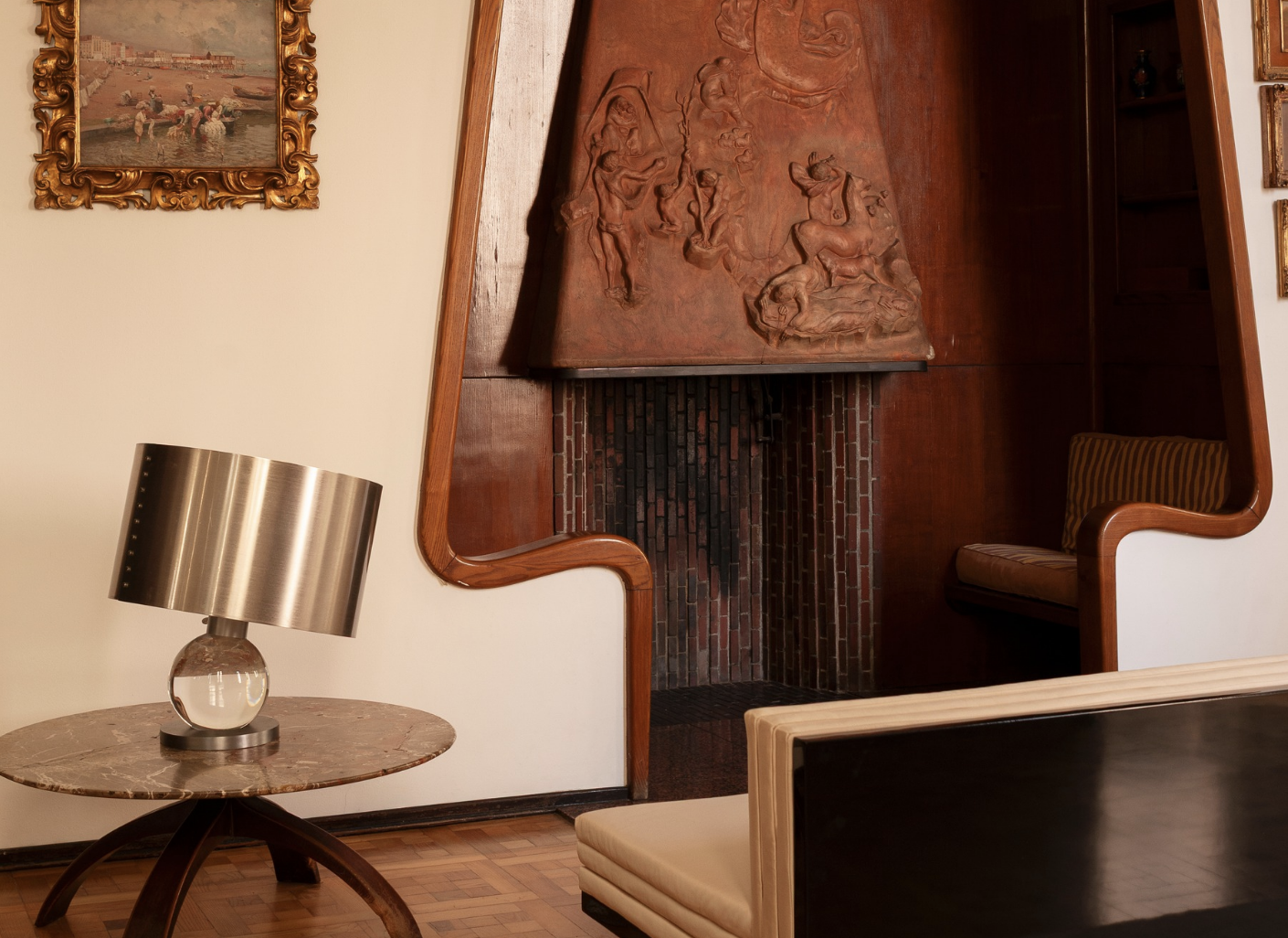
Cover picture: INTERNI VENOSTA / INTERNO ITALIANO / PH Andrea Ferrari